
Overview
{{ p }}
- {{ f.k }}
- {{ f.v }}
{{ problemKicker }}
{{ cs.problemLead }}
{{ cs.problemBody }}
{{ pt.title }}
{{ pt.body }}
The problem was not capturing more information. It was turning context into action.
Finding the gap between thinking and execution
I reviewed patterns across project-management tools, collaborative whiteboards, documents, and AI assistants to understand where each model worked well — and where the workflow broke down.
{{ p.title }}
{{ p.body }}
Combine the flexibility of messy input with the structure needed to move work forward.
My Role
{{ cs.roleBody }}
- — {{ r }}
{{ processTitle }}
{{ m.label }}
{{ m.body }}
→{{ cs.processNote }}
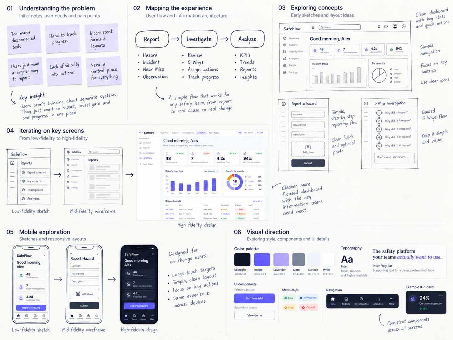
I audited the existing tools and workflows, then reorganised the experience around three simple stages.
{{ s.title }}
{{ s.body }}
The interface follows how teams think
Instead of organizing Nova around AI features, I organized the experience around the progression of the work itself.
The product needed to support both a guided setup journey and the non-linear way real project work happens after setup.
Testing the interaction model before the visual design
My early sketches focused on three questions:
- — {{ q }}
From rough idea to focused workspace
{{ decisionsTitle }}
{{ d.title }}
{{ d.body }}
{{ screensTitle }}
One continuous path from context to execution
Start with the mess, not a blank form
The source brief stays intact on the left while Nova extracts goals, requirements, constraints, risks, and open questions on the right. The middle column shows what is being pulled out, as it happens.
A reasoning workspace, not a wizard
Fragments on the left, AI-proposed clusters in the middle, workstreams on the right. Every cluster carries its own accept, edit, merge, and reject controls, so the structure is reviewed rather than accepted wholesale.
Approved context becomes a spatial plan
Goals, design and engineering workstreams, risks, decisions, and milestones sit on one canvas with their dependencies drawn between them. A minimap keeps orientation as the plan grows.
Decision intelligence, not a notes page
Each decision keeps its owner, evidence, alternatives, risks, and final rationale in one place. Nova reports the downstream impact beside it — here, three blocked tasks and a week of timeline shift.
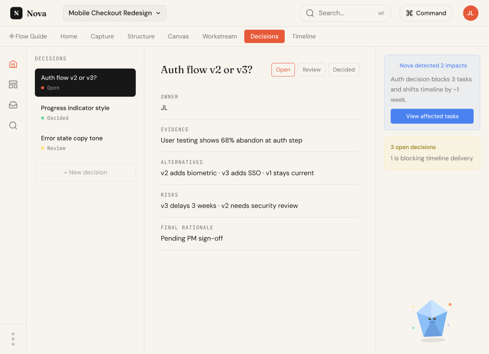
Detail: the impact panel states what a delay costs before anyone commits to it.
AI when you need it
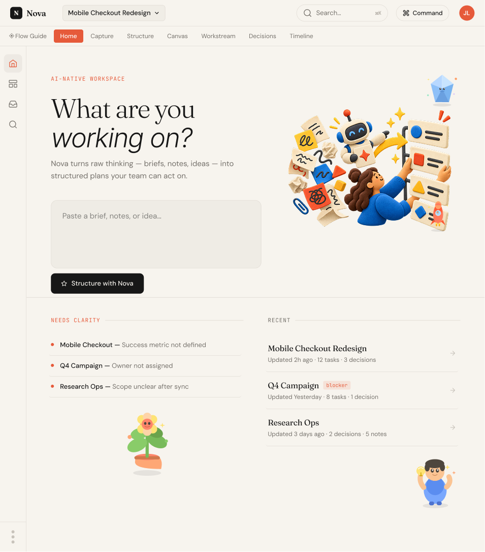
The command layer gives fast access to actions such as finding blockers, summarizing changes, surfacing open decisions, and generating next steps — reachable from anywhere in the workspace.
- {{ c.key }} {{ c.label }}
Structure carries into execution
Accepted clusters become workstreams with owners and progress, so the plan and the work stay the same object rather than diverging into a separate tracker.
Conflicts surface before they cost a sprint
Workstreams run as horizontal bands with risk markers inline. When design approval creates a three-day QA conflict, Nova says so and offers rebalance, review, or ignore — the user still decides.
Open on what needs you
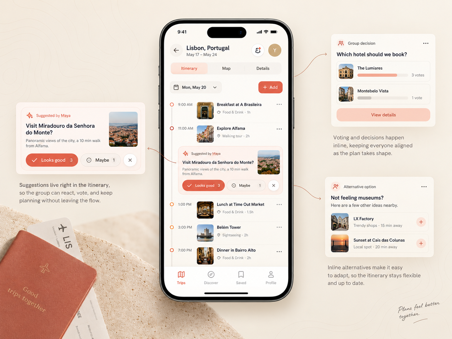
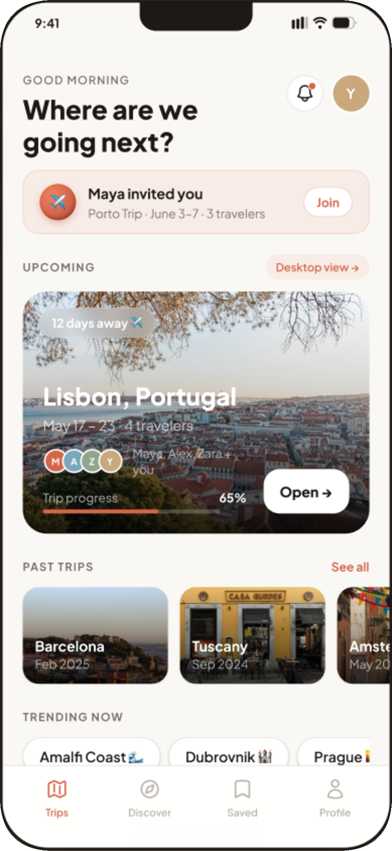
The first screen leads with an invite waiting for a reply and the trip that is closest, so a member who checks in briefly sees the state of things without opening anything.
Saved once, visible to everyone
Every saved place carries its category, rating, and who voted for it — so the group can see what has support before anything reaches the itinerary.
Vote counts sit on the card itself, not behind a tap. The bookmark state is the only affordance that changes, which keeps a dense grid quiet.
- {{ n.n }} {{ n.text }}
The group sets the terms before AI plans
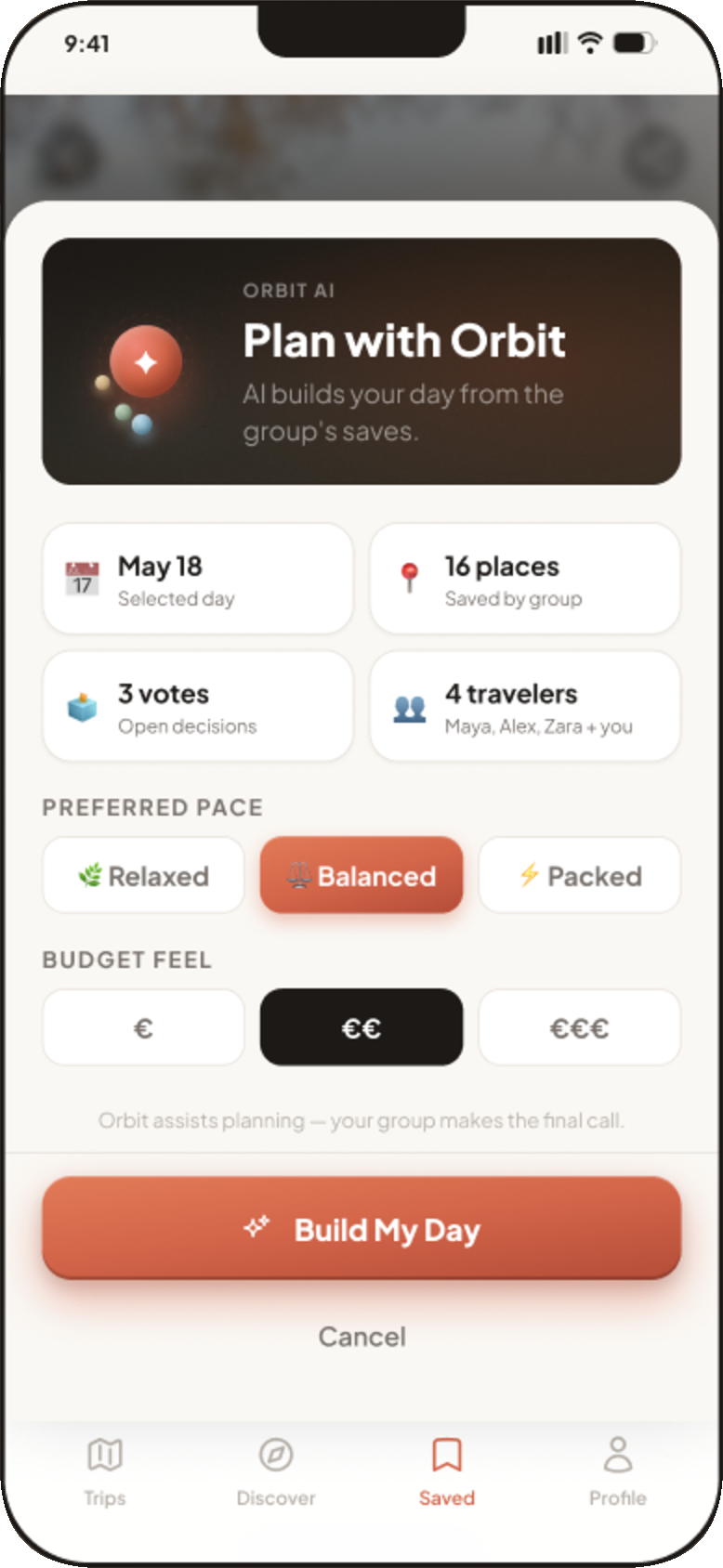
Pace and budget are chosen up front, the plan states what it matched and what it saved, and every stop can be locked, removed, or refined. Orbit assists; the group still makes the call.
The same trip, more room to arrange it
On desktop the itinerary becomes a planner: travellers and saved places stay in view while the day is reordered, and the AI panel reports its reasoning as it works.
UI System
Warm, photographic, and quiet enough to let places lead
One terracotta accent carries every primary action and active state. Everything else is warm neutral, so trip photography stays the most saturated thing on screen.
A single grotesk across the product. Hierarchy comes from weight and size only — no second family, no italics.
Cards, chips, and sheets share one radius family and one border weight, so a dense screen still reads as a single surface.
{{ r.title }}
{{ r.body }}
Walk the Platform
Live interface · scrollableThe full platform, end to end — reporting, investigations, dashboards, and resources in the order a safety lead moves through them.
Design System
A system built for reviewing machine output
Most of Nova's interface exists to make an AI interpretation legible. That put unusual demands on the system: every generated object needs a state, a source, and a way to be refused.
{{ n.v }}
Colour, type, buttons, inputs, status chips, the source-to-suggestion pattern, and the command palette — documented as one sheet.
Outcome
{{ cs.outcomeLead }}
{{ reflectionTitle }}
{{ cs.outcomeLead }}
{{ p }}
{{ cs.nextName }}
{{ cs.nextTagline }}